Showing posts with label temperature records. Show all posts

2015/01/08

Satellite Temperatures

A post from Spencer:

Why Do Different Satellite Datasets Produce Different Global Temperature Trends?

January 6th, 2015 by Roy W. Spencer, Ph. D.
I thought it would be useful to again outline the basic reasons why different satellite global temperature datasets (say, UAH and RSS) produce somewhat different temperature trends.
They all stem from the fact that there is not a single satellite which has been operating continuously, in a stable orbit, measuring a constant layer of the atmosphere, at the same local time every day, with no instrumental calibration drifts.
Instead, what we have is multiple satellites (we use 14 of them for the UAH processing) with relatively short lifetimes (2 to 16+ years), most of which have decaying orbits which causes the local time of measurement to slowly change over the years, slightly different layers sampled by the earlier (pre-1998) MSU instruments compared to the later (post-1998) AMSU instruments, and some evidence of small calibration drifts in a few of the instruments.
An additional complication is that subsequent satellites are launched into alternating sun-synchronous orbit times, nominally 1:30 a.m. and p.m., then 7:30 a.m. and p.m., then back to 1:30 a.m. and p.m., etc. Furthermore, as the instruments scan across the Earth, the altitude in the atmosphere that is sampled changes as the Earth incidence angle of view changes.
All of these effects must be accounted for, and there is no demonstrably “best” method to handle any of them. For example, RSS uses a climate model to correct for the changing time of day the observations are made (the so-called diurnal drift problem), while we use an empirical approach. This correction is particularly difficult because it varies with geographic location, time of year, terrain altitude, etc. RSS does not use exactly the same satellites as we do, nor do they use the same formula for computing a lower tropospheric (“LT”) layer temperature from the different view angles of AMSU channel 5.
We have been working hard on producing our new Version 6 dataset, revamping virtually all of the processing steps, and it has taken much longer than expected. We have learned a lot over the years, but with only 2-3 people working part time with very little funding, progress is slow.
In just the last month, we have had what amounts to a paradigm shift on how to analyze the data. We are very hopeful that the resulting dataset will be demonstrably better than our current version. Only time will tell.

----------------------
Basically he is saying that ALL satellite temperature are models with various bodges to correct for satellite inconsistencies.

This generated a post:
David A says:
“So you are saying that all satellite temperatures are models with a few bodges added?”
Of course. The satellites aren’t measuring temperatures, they’re measuring microwaves. It takes a data model to convert those into temperatures…. He’s a description of RSS’s algorithm; it’s quite complex:
“Climate Algorithm Theoretical Basis Document (C-ATBD)”
RSS Version 3.3 MSU/AMSU-A Mean Layer Atmospheric Temperature
http://images.remss.com/papers/msu/MSU_AMSU_C-ATBD.pdf
It’s not clear to me why satellite temperatures are said to be clean and exact while surface measurements are not….

followed by a post from Spencer:

Roy Spencer says:
Franco, not in the case of microwave emission in the 50-60 GHz range, which depends on the concentration of molecular oxygen, which is extremely stable in space and time (unlike CO2).

I then tried to post a comment only to find I have seemingly been banned:
 
CO2 and O2 are linked as one would expect so O2 is not constant see the post here
climateandstuff.blogspot.co.uk/2012/06/further-thoughts-on-co2-cycle.html
(repeat post as 1st got trashed.

This linked to a post on this blog with the following plot:


O2 is not constant over a year and continually falls over the period shown (it's locked to co2 cycle!). If Spencer believes O2 is constant then perhaps this is a source of error in his UAH measurements!!

Additional info on oxygen plot:

http://bluemoon.ucsd.edu/publications/ralph/Keeling_et_al_Tellus_07.pdf

The primary O2/N2 reference gases (or ‘primaries’) used at Scripps consist of 12 tanks filled between 1986 and 1989, and an additional set of six filled between 1993 and 1994, as summarized
in .....
The large size of the atmospheric O2 reservoir makes measurements of the relatively small changes in O2 concentration challenging. Resolving a land biotic sink of 2 Pg C requires the
ability to detect a change of ∼1.8 × 10¹⁴ moles in the global O2 abundance, which corresponds to 0.000 49% of the total burden of O2 in the atmosphere. Changes in O2 concentration are
typically expressed in terms of the relative change in O2/N2 ratio δ(O2/N2) = (O2/N2)sample/ O2/N2)reference − 1, where δ(O2/N2) is multiplied by 10e6 and expressed in ‘per meg’ units. In these units, a change of 1.8×10e14 moles in the globalO2 abundance corresponds to a change of 4.9 per meg. In spite of the measurement challenge, there are now at least six independent
O2 measurement techniques in use that have demonstrated a precision at the level 6 per meg or better (Keeling, 1988a; Bender et al., 1994; Manning et al., 1999; Tohjima, 2000; Stephens et al., 2003; Stephens et al., 2006), and these methods are being variously applied for flask or in situ  measurements by at least 12 scientific institutions.

2015/01/04

RSS TLT data from whole monthly record

Using the full monthly data set from RSS lower troposphere temperature (Often truncated to 1996 to latest to show no temperature rise - see wuwt and Monkton).

continental us data when smoothed is same as +-80° global
slope is 0.01°C/year

2013/08/18

Factors affecting DLWIR - NREL data (re-analysis)

Data from NREL re-analysed - spread sheet corrected, ULWIR nulling removed as this is basically the same as temperature, latest data added.

Data is dependent on cloud cover. Unfortunately cloud data is only available during daylight. Hours of darkness therefore are not included in this analysis


 The first plot shows the variation with date  (2004 to 2013) Unfortunately the calibration of the pyrgeometer (including device swapping on every calibration) shows up as a signal greater than any trend. The calibration dates are shown as dotted blue lines.

2004 - 2006 31192F3 large error
2006 - 2008 31194F3 10 w/sqm drop
2008 - 2009 31192F3 random 8w/sqm p-p
2009 - 2011 31194F3 10 w/sqm drop
2011 - 2012 31192F3 random 13w/sqm p-p
2012 - 2013 31194F3 random 10w/sqm p-p
It appears that 31194F3 has a drift with time (now possibly corrected)
Also it seems that +-5w/sqm is the expected accuracy for this type of pyrgeometer


Luckily this is the only data extraction that is synchronous with date. Other extraction will tend to remove the drift by averaging. It is significant that the calibration adjustments show up indicating that this spreadsheet successfully sees valid changes of <5w class="goog-spellcheck-word" span="" style="background: none repeat scroll 0% 0% yellow;">sqm

This next plot shows the expected variation of dlwir with temperature.

It should be noted that the drop in value at the high temperature end is most likely due to the small number of results returned and is therefore not valid.

The net plot shows the effect of increasing absolute humidity

The following pair show the change with day of the year. Note that temperature effects should have been nulled so the peak should not be due to summer temperature. The second plot compares La Jolla CO2 with the dwlir. The dwlir seems to show the inverse of what would be expected!


Station pressure below, has very little effect on dwlir


Opaque cloud cover increases the dwlir!


Data from:
http://www.nrel.gov/midc/srrl_bms/


2013/07/08

Temperature dependence - more analysis of NREL data

This analysis shows the interdependence of temperature and other data.
Temperature may be the cause or the effect!
The second curve on each plot shows the number of results returned. Obviously the more results the more likely the data returned is valid.
All data is averaged with the top and bottom 30% discarded to remove outliers


Temperature is affected negatively by the absolute humidity (gms h2o/cu m). To heat air and water vapour takes more energy than air alone hence the negative slope.


Using the nulling technique produces a plot with little day of year dependence (no annual peak or dip is obvious).
The slope of the line is =0.0001602 per day. This equates to 0.585°C per decade and this is over a period that people say the warming has stopped!


As expected with opaque cloud cover the temperature is negatively correlated.


Temperature with day of year is as expected with a peak at day 200 (19th July) and a minimum at day 40 (9th February). These dates are of course offset from longest/shortest day.

Plots of the nulled variables:


Note that the nulled portion is sometimes limited to less than whole range. In this case a limit is used to only accept data for that nulled range on that variable

Also the nulling process is only used to produce a line of zero slope for each variable - the offset from zero is not relevant as only anomalies are plotted.

Data from:
http://www.nrel.gov/midc/srrl_bms/


2013/02/09

What Affects DLWIR?

Using the same data source as before, the same parameter nulling gives this set of curves


This is the variation of DLWIR with day of the year (as before but low prob results retained)

This is absolute humidity effect - not linear

Interesting (night is disabled - no cloud information) but DLWIR is greater in mornings and evenings.  Why not midday?

Station Pressure - Possibly a problem with conversion between % hum and abs humidity causes this.

Linear effect with temperature as would be expected

Again a non linear relation with ULWIR
Wild errors are removed from the result by using the trimmean funcion disposing of 25% of highest and 25% lowest values.
Cloud values are measured using a visual light camera - hence no results will be returned for hours of darkness for this analysis.

===========UPDATE====================================================
Instrumentation
u/dlwir
PRECISION INFRARED RADIOMETER
Model PIR
The Precision Infrared Radiometer, Pyrgeometer, is intended for unidirectional operation in the measurement, separately, of incoming or outgoing terrestrial radiation as distinct from net long-wave flux. The PIR comprises a circular multi-junction wire-wound Eppley thermopile which has the ability to withstand severe mechanical vibration and shock. Its receiver is coated with Parson's black lacquer (non-wavelength selective absorption). Temperature compensation of detector response is incorporated. Radiation emitted by the detector in its corresponding orientation is automatically compensated, eliminating that portion of the signal. A battery voltage, precisely controlled by a thermistor which senses detector temperature continuously, is introduced into the principle electrical circuit.
Isolation of long-wave radiation from solar short-wave radiation in daytime is accomplished by using a silicone dome. The inner surface of this hemisphere has a vacuum-deposited interference filter with a transmission range of approximately 3.5 to 50 µm.
SPECIFICATIONS
Sensitivity: approx. 4 µV/Wm-2.
Impedance: approx. 700 Ohms.
Temperature Dependence: ±1% over ambient temperature range -20 to +40°C.
Linearity: ±1% from 0 to 700 Wm-2.
Response time: 2 seconds (1/e signal).
Cosine: better than 5%.
Mechanical Vibration: tested up to 20 g's without damage.
Calibration: blackbody reference.
Size: 5.75 inch diameter, 3.5 inches high.
Weight: 7 pounds.
Orientation: Performance is not affected by orientation or tilt.
-------------------------
This looks as if it is measuring the heating effect (thermopile) of radiation hitting the dome of the sensor (transmission 3.5 to 50um. The thermopile of course generates a voltage dependant on the temperature difference between one side and the other The non-dome side is not exposed to external radiation so no effect there. However, the nondome side temperature must be measured and compensated.
The instrument also compensates for its own generated IR.
No assumption of BB radiation is assumed. It is the ACTUAL heating effect of IR radiation of narrow or wide bandwith hitting the sensor that is the cause.

If the radiative "temperature" is less than the receiver temperature then the thermopile still measures - see series of posts about thermal imaging - the camera microbolometers sitting at 20+C shows temperatures down to -40C

======================================================================
Dry bulb temperature / wet bulb / relative humidity

HMP45C-L Specifications

  • Supply Voltage: 12 Vdc nominal (typically powered by datalogger)
  • Current Drain: ≤4 mA (active)
  • Sensor Diameter: 2.5 cm (1 in.)
  • Sensor Length: 25.4 cm (10 in.)
  • Cable Diameter: 0.8 cm (0.3 in.)
  • Weight: 0.27 kg (0.6 lb)

Relative Humidity

  • Sensor: Vaisala’s HUMICAP® H-chip
  • Measurement Range:
    0.8% to 100% RH, non-condensing
  • Output Signal Range:
    0.008 to 1 Vdc
  • Accuracy at 20°C (against factory reference): ±1% RH
  • Accuracy at 20°C (field-calibrated against references):
    ±2% (0% to 90% RH);
    ±3% (90% to 100% RH)
  • Temperature Dependence: ±0.05% RH/°C
  • Long-Term Stability: Typically, better than 1% RH per year
  • Response Time: 15 s with membrane filter (at 20°C, 90% response)
  • Settling Time: 500 ms

Temperature

  • Temperature Sensor: 1000 ohm Platinum Resistance Thermometer
  • Measurement Range: -39.2° to +60°C
  • Output Signal Range:
    0.008 to 1.0 V
  • Accuracy:
    ±0.5°C (-40°C),
    ±0.4°C (-20°C),
    ±0.3°C (0°C),
    ±0.2°C (20°C),
    ±0.3°C (40°C),
    ±0.4°C (60°C)
====================================================================
Cloud - total and opaque

TSI-880 AUTOMATIC TOTAL SKY IMAGER

General Description The Total Sky Imager Model TSI-880 is an automatic, full-color sky imager system that provides real-time processing and display of daytime sky conditions. At many sites, the accurate determination of sky conditions is a highly desirable yet rarely attainable goal. Traditionally, human observers reported sky conditions, resulting in considerable discrepancies from subjective observations. In practice, the use of human observers is not always feasible due to budgetary constraints. The TSI-880 now replaces the need for these human observers under all weather conditions.
An onboard processor computes both fractional cloud cover and sunshine duration, storing the results and presenting data to users via an easy-to-use web browser interface. The self-contained design makes it well suited for mission-critical applications such as aviation and military meteorology monitoring. It captures images into standard JPEG files that are analyzed into fractional cloud cover; if networked via TCP/IP (10/100BaseT) or PPP (modem) it becomes a sky image server to remote any user via the web.

TSI-880 AUTOMATIC TOTAL SKY IMAGER

General Description The Total Sky Imager Model TSI-880 is an automatic, full-color sky imager system that provides real-time processing and display of daytime sky conditions. At many sites, the accurate determination of sky conditions is a highly desirable yet rarely attainable goal. Traditionally, human observers reported sky conditions, resulting in considerable discrepancies from subjective observations. In practice, the use of human observers is not always feasible due to budgetary constraints. The TSI-880 now replaces the need for these human observers under all weather conditions.
An onboard processor computes both fractional cloud cover and sunshine duration, storing the results and presenting data to users via an easy-to-use web browser interface. The self-contained design makes it well suited for mission-critical applications such as aviation and military meteorology monitoring. It captures images into standard JPEG files that are analyzed into fractional cloud cover; if networked via TCP/IP (10/100BaseT) or PPP (modem) it becomes a sky image server to remote any user via the web.
Specifications

Image Resolution: 352 x 288 color, 24-bit JPEG format
Sampling rate: Variable, with max of 30 sec
Operating Temperature: -40 C to +44 C
Weight/Size: Approx.70 lbs.(32 kg); dims: 20.83"x18.78"; height is 34.19"; mounts on 16.75x12" 1/4-20 bolt square
Power Requirements: 115/230 Vac; mirror heater duty cycle varies with air temperature: 560W with heater on / 60W off
Software: None required for immediate real time display; uses Internet Explorer or Netscape Browsers on MS-Windows, Mac, UNIX (an optional DVE/YESDAQ package is available for data archiving, display, MPEG day movie creation and data reprocessing)
Data Telemetry: LAN Ethernet (TCP/IP), telephone modem (PPP) or Data Storage Module option (for off grid sites)
====================================================================================
Precipitation:

TE525-L Specifications

  • Sensor Type: Tipping bucket/magnetic reed switch
  • Material: Anodized aluminum
  • Temperature: 0° to +50°C
  • Resolution: 1 tip
  • Volume per Tip: 0.16 fl. oz/tip (4.73 ml/tip)
  • Rainfall per Tip: 0.01 in. (0.254 mm)
  • Accuracy
    Up to 1 in./hr: ±1%
    1 to 2 in./hr: +0, -3%
    2 to 3 in./hr: +0, -5%
  • Funnel Collector Diameter:
    15.4 cm (6.06 in.)
  • Height: 24.1 cm (9.5 in.)
  • Tipping Bucket Weight:
    0.9 kg (2.0 lb)
====================================================================================
Station Pressure

CS105/CS105MD Barometric Pressure
Sensor
1. General
The CS105 analog barometer uses Vaisala’s Barocap silicon capacitive
pressure sensor. The Barocap sensor has been designed for accurate and stable
measurement of barometric pressure. The CS105 outputs a linear 0 to 2.5
VDC signal that corresponds to 600 to 1060 mb. It can be operated in a
powerup or continuous mode. In the powerup mode the datalogger switches
12 VDC power to the barometer during the measurement. The datalogger then
powers down the barometer between measurements to conserve power.
2. Specifications
Operating Range
Pressure: 600 mb to 1060 mb
Temperature: -40 C to +60 C
Humidity: non-condensing
Accuracy
Total Accuracy*** 0.5 mb @ +20 C
2 mb @ 0 C to +40 C
4 mb @ -20 C to +45 C
6 mb @ -40 C to +60 C
Linearity*: 0.45 mb @ 20 C
Hysteresis*: 0.05 mb @ 20 C
Repeatability*: 0.05 mb @ 20 C
Calibration uncertainty**: 0.15 mb @ 20 C
Long-Term Stability: 0.1 mb per year
* Defined as 2 standard deviation limits of end-point non-linearity,
hysteresis error, or repeatability error
** Defined as 2 standard deviation limits of inaccuracy of the working
standard at 1000 mb in comparison to international standards (NIST)
*** Defined as the root sum of the squares (RSS) of end-point non-linearity,
hysteresis error, repeatability error and calibration uncertainty at room
temperature


2013/01/20

Yearly CO2 variation Shown as Change in DLWIR?

Not sure about this post.
The data used is short
The data is noisy
Subtracting noisy signals does not improve accuracy!!

{UPDATE This data has now changed - I have nulled out the day of year changes and the long term variation(whole record) which significantly changes the results - the results will be posted at a later date]

Basically if CO2 is low then "back radiation" (DLWIR) should be lower than when CO2 is high
There is an annual cycly where CO2 dips in late spring and rises in autumn - see other posts.

So if you remove all factors changing downward long wave infrared radiation other than CO2 then what should be left is the yearly change in CO2 plus the long term increase.

The nulled data is inspected and a simple curve fit is applied and limits chosen that provide the best null for that factor.

Returned data that meets the criteria are averaged using a TRIMMEAN function to remove spurious high/low values

If the data is treated as a reapeated annual set then the long term becomes averaged and only the annual effect remains.

In the plots below the Nulled measurements are shown and CO2 at La Jolla is plotted for comparison.

The hourly measurement data is used

The analysis has been run many times each time there is always a dip starting at ~190 ( some ~60 days after the CO2 starts reducing)
Accuracy is nonsensical if less than 3 valid data are returned This unfortunately eliminates dec jan feb!.

However here are the final plots:
The raw data  (all points returning under 3 samples ignored) compared to La Jolla CO2

The smoothed data  (all points returning under 3 samples ignored) compare to La Jolla CO2
To pick sensible values for a number of variables the following limits are used.

Precipitation limit is set to eliminate any reading during "precipitation"
Cloud can only be measured during daylight
Only opaque cloud is considered
Humidity % is not used but is converted to absolute water vapour 

The Nulling Process

Each of the variables is nulled by plotting dlwir against the variable. Fitting a polynomial (order 1 to 6) to the resultant and then providing limits that deviate from the polynomial.  The polynomial is then applied to the extracted data.
Each variable is treated this way and then the process repeated until little change occurs. This produces the follwing limits.

start month1
End month12
hour min11
hour max15
Temp min12.4
Temp max29.4
Humidity Min0
Humidity Max1000
opaque Cloud Cover % min2.8
opaque Cloud Cover % Max30.9
cloud cover min-999999
cloud cover max 1000
abs humid min2.12
abs humid max10.5
dlwir min0
dlwir max1000
ulwir min445
ulwir max595
dlwir as pc uplwir min0
dlwir as pc uplwir max100
start day1
end day19.2499
Pressure Min809
Pressure Max825
precipitation min-1
precipitation Max0.00001

These are the corrections applied:

Temperature opaque cldABS HUMIDITYULWIRhourStation pressure
x^6-2.925607E-060.00E+000000
x^54.16E-04-1.30E-050-1.73074E-090.011610750
x^4-2.35E-021.05E-03-0.019222434.37603E-06-0.7941290
x^36.78E-01-3.04E-020.5449762-0.00440410821.56523-0.001826181
x^2-1.05E+013.83E-01-5.6047922.20558-290.41164.45165
x8.40E+01-1.07E+0029.91783-549.63951938.646-3617.085
c3.22E+012.81E+02108.47335.40E+04-5133.338979613.7

The nulling plots (not prettied up!)


Red plots are the result of nulling
blue lines are before nulling

Excel sheet is available (large)
Data is from (hourly):
http://www.nrel.gov/midc/srrl_bms/

Currently ~ 80,000 lines are analysed


2013/01/14

Grape Harvest Temperature Reconstructions - More Stuff

Western European climate, and Pinot noir grape harvest dates in Burgundy, France, since the 17th century

http://www.int-res.com/articles/cr_oa/c046p243.pdf

from the document:


And something I did a few years ago.
Note the vertical scales are offset but per division scales are correct


And a comparison to CET


There seems to be no further analysis (more recent than 2003) which was done by:

 Chuine I, Yiou P, Viovy N, Seguin B, Daux V, Leroy Ladurie E (2004) Grape ripening as a past climate indicator.

From the above it seems that grapes despite possible  cultivar changes give a good proxy for temperature.

http://www.cefe.cnrs.fr/images/stories/DPTEFonctionnelle/BIOFLUX/Chercheurs/isabelle_chuine/publications/ChuineNature2004.pdf

http://www-ecole.enitab.fr/people/kees.vanleeuwen/articles/PI_36.pdf

2012/08/27

NOAA/NCDC and BEST compared to Watts Favourite


Now found some US data (presumed ALL US not just CONUS) up to 2012 from NOAA
 http://www7.ncdc.noaa.gov/CDO/CDODivisionalSelect.jsp

These are monthly (like BEST) and so to fit with USCRN/USRCRN daily dat I have assumed a months worth of constant temperature for both these sources. This data is then passed through the same processing as the USCRN/USRCRN to produce the plot.

As can be seen the NOAA data for June is significantly higher than USCRN so Tony's claim of "not the warmest July" may be correct. However the overall trend of NOAA is significantly downwards compared tio the upwards trend of USCRN.

This being the case Tony may be backing the wrong horse in this race. USCRN (his ACCURATE) data stream show continual warming over the last decade. Time will tell (hopefully before disater strikes!).


uscrn 60 days average
noaa 200 day average
Best 80 day average


2012/08/26

The Effect Of Anomaly reference period on Temperature Plots

Much rubbish is talked in some locations about how the reference period for anomaly plots is chosen to to create worse temperature rises than reality.

Here is a plot showing monthly data from UK station temperatures. These are converted into anomalies by taking 30 Januarys from the start year, averaging the temperature and then subtracting this from each January to create an anomaly. This is repeated for each month to create the full plot.

This method shows how met. stations are warming and allows a reasonable average anomaly to be calculated over dissimilar (envirnonmentally) stations. It also removes the annual fluctuation in temperature reducing the need to filter this out.

The plot shows 5 different start years from 1951 to 1991 (the latter only having 20 years averaged for the anomaly calculation.

As can be seen all that happens is the plot gets shifted up and down the chart. The wiggles and the slope are constant.

NO ADDITIONAL WARMING is created by changing the reference period. The reference period is not relevant unless the distribution of temperatures throughout the year changes.

2012/08/22

USCRN compared to Best

Plot showing Best and USCRN data.
Best is monthly data Average
USCRN is daily Average

Quite a good match (bearing in mind Best is7500 stations and USCRN is 40)

The match becomes better as more uscrn stations come on line

The slope of linear trend is -ve in Best +ve in uscrn mainly due to Best data terminating in 2011


Berkley Data Here


2012/08/19

USCRN/USRCRN - The CONUS data

Data from the contiguous states of USA.

This is derived from all locations that have reported data from 2003 onwards. The more rescently commissioned sites therefore do not appear

The average plot shows a temperature increase of 0.3K per decade
The maximum plot shows a temperature increase of 0.6K per decade
The minimum plot shows a temperature increase of 0.14K per decade

The main plots are averaged over 10 days
The spaghetti plot is averaged over 100 days

It is interesting to note that the temperature increase since 2010 is much greater than that for the whole plot the final plot here shows a temperature increase of 6.8K per decade (PS. I realise that this is more weather than climate!)

How will watts handle this?!!!!!!!


And a final a couple with longer averaging
1. showing a 200 day averaged max chart


2. showing a 400 day averaged spaghetti plot


The last 3 years:


2012/08/12

USCRN/USRCRN - "perfect" data and how it compares

A quick look at a few CONUS (contiguous US states) data

"ITS WORSE THAN WE THOUGHT!"


http://wattsupwiththat.com/2012/08/08/an-incovenient-result-july-2012-not-a-record-breaker-according-to-the-new-noaancdc-national-climate-reference-network/

Tony has said that this date is as good as it is going to get as far as temperatures go.
He has invalidly compared USCRN with the older ghcn network using absolute values (does not get rid of any offsets between the data sets). And concludes this July is not a record breaker.

Leaving "records" aside this is the plot for 12 of the stations reporting from 2002 to current date (daily data)

A note: some of the stations reporting early in 2002 have much missing data that seems to give a high temperature anomaly in the first few months. This has been left in.

These are a simple arithmetic average of the 12 station data which individually have been averaged over 20days

This is a first stab at these plots so they may change if errors are found

Data from:
ftp://ftp.ncdc.noaa.gov/pub/data/uscrn/products/daily01
plots updated - more data - corrected averaging

Max temperature plot


Linear fit gives 0.774C/decade


Min temperature plot


Linear fit gives 0..22C per dacade


Average temperature plot


Linear fit gives 0.44C per decade


Spaghetti plot showing station names


As a comparison here is the plot for crutem3v from wft

Over the same period a negative slope!

I wonder if Tony will reject the USCRN data in the same manner as he tried to kill the Best data!


2012/07/31

Tony - Free the Data, Free the Code

Well Watts drummed up phenominal interest with his closing wuwt posting scam. Then came the letdown - it's another surface station project writeup. Hummmm!

Hopefully Tony can provide at least the following data he used:

A list of all (ALL qualities) stations
Accurate co-ordinates for site so that Measurement machine can be identified at its centre.
Type of measurement device
Details of any changes/calibrations
Criteria used for Watts' classification for that site
Date site was surveyed - date of Google imagery.

We need this data long before publication!

The data seems to forgotten that TOBS (time of observation) needs to be added before comparison to USHCN is made:
Steve: allowing for a TOBS adjustment is reasonable enough. When max min are read daily, if they are read in late afternoon near the daily maximum, a hot day can end up contributing to the maxima for two consecutive days and the cooler next day not counted. The adjustment is made relative to theoretical midnight readings

It seems that McIntyre thinks he should have done more work before allowing his name to be added to the author list!

Steve: As I mentioned, I’ve been involved with this paper for only a few days. You know my personal policies. I did some limited statistical analysis, which, to my considerable annoyance, I need to revisit. As you know, I don’t have a whole lot of interest in temperature data, which is an absolute sink for time. So I’m going to either have to do the statistics from the ground up according to my standards or not touch it anymore.
Steve: I was only on the paper a short time and I overlooked an important issue, which Anthony had paid insufficient attention to. I should have known better – my bad. I’m very annoyed at myself.
Steve McIntyre Posted Jul 31, 2012 at 2:07 PM | Permalink | Reply
In my original look at this information (2007) here, I used TOBS data. I need to revisit this work.

Another  "author" falls by the wayside!
https://pielkeclimatesci.wordpress.com/2012/07/31/summary-of-two-game-changing-papers-watts-et-al-2012-and-mcnider-et-al-2012/

UPDATE #2: To make sure everyone clearly recognizes my involvement with both papers, I provided Anthony suggested text and references for his article [I am not a co-author of the Watts et al paper], and am a co-author on the McNider et al paper.

2011/11/05

Just How good Are Satellite Derived Temperatures (updated)

Many changes have been made to satellite derive temperatures ( I have asked Spencer to explain the differences and unrecorded adjustments on many blogs. BUT never has he bothered to explain).
With the current BEST surface temperature  slanging matches raging on the anti AGW blogs all eyes seem to be turning to the satellite record and opinions seem to suggest that these results are what everyone should be usingas the gold standard (mainly because they only show the last 8 year and these have a cooling trend!!)

What goes up must (in earth orbit) eventually come down.
NOAA-15 was once the satellite producing the temperature records (from 1998) however as the hardware progressively fails the data from the AQUA satellite has been used (data available from 2002)

This gave a 6 year overlap where the temperatures could be compared and corrected. This, according to Leif Svalgaard is what happens with the TSI measurements for solar activity.

My complaint is that there is a LARGE error in data between AQUA and NOAA-15 and no attempt to reconcile the differences is made or explanations given.
Indeed The UAH team handling the data seem to adjust data at a whim.
For example: for channel 05 AQUA between the dates of 2010-07-03 and 2011-10-01 data missing in the earlier plot suddenly appeared in the later plot  (from 2009-02-01 to 2009-02-03 and on 2010-11-25 and 2010-11-26 Why and how? Also in my data the earlier records were one day adrift !! (could have been me however)

People are quibbling about discrepancies of 0.12 K/decade  but looking at the comparison between NOAA-15 data and AQUA this 0.12K/decade is the discrepancies produced by the two satellites and modified by the same team.

Chan 05
.

From the above plot during the overlap period:
NOAA warming is 3.27e-5K/day = 0.119K/decade
AQUA warming is -1.95e-5K/day = -0.0712K/decade
Also of interest is the two plots for the same series but obtained at different times red and blue in the plot these seem to have been revised without explanation (by up to .08K)

Looking at CH 4 data, the current data on their web site runs from 2002 to 2008 (with the last 6 monts failing) The data that was available (NOAA?) went from 1998 to 2011 and despite this being the longer record  is not used on their Discover website.


Again the slope over the valid overlap period is:
AQUA 1.0404e-5K/day = 0.0380K/decade
NOAA 1.1879e-4K/day = 0.434K/decade


Another series CH06


AQUA -4.2323e-5K/day = -0.154K/decade
NOAA -1.7595e-4K/day = -0.642K/decade

Chan 10


AQUA -6.59e-5K/day = -0.2345K/decade
NOAA -9.58e-4K/day = -0.3411K/decade
Chan 13


AQUA -2.1174e-4K/day = -0.754K/decade
NOAA -1.4831e-4K/day = -0.528K/decade

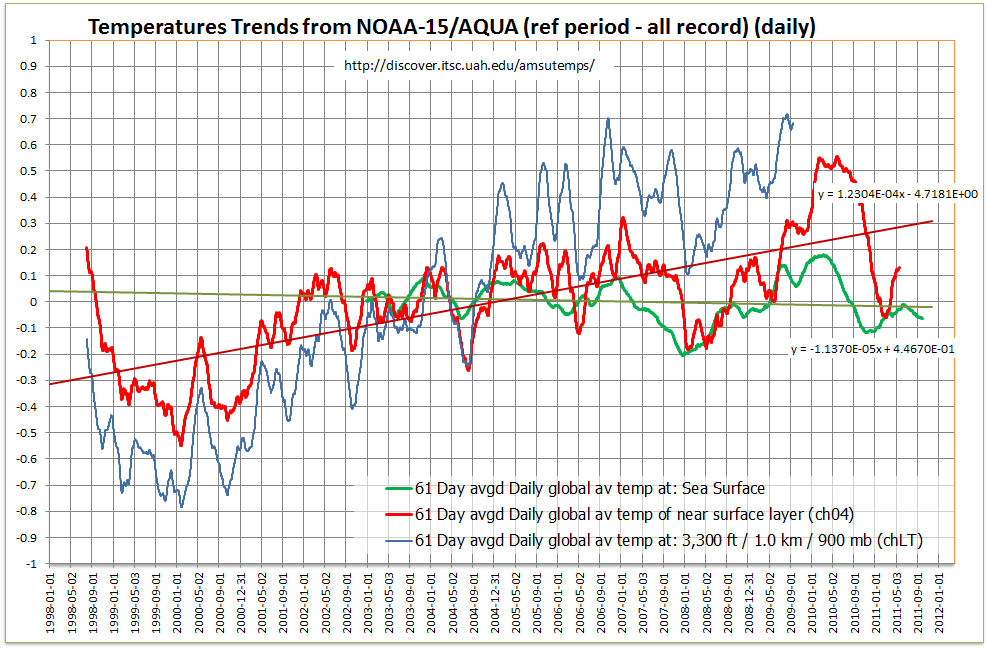
Another plot shows that CHLT (NOAA defunct) and CH04 (recently AQUA defunct) had peaks and troughs occurring at the same time. However comparing CH04 to Sea Surface temperature the temperature of the sea changes BEFORE the air temperature by a couple of months. HOW?


Absolute temperature differences
CH4 NOAA) - (CH4 AQUA)=-2K
( CH5 NOAA) - (CH5 AQUA)=-0.11K
( CH6 NOAA) - (CH6 AQUA)=-0.99K
( CH10 NOAA) - (CH10 AQUA)=-0.279K
( CH13 NOAA) - (CH13 AQUA)=0.062K
Conclusion

There seems to be many more problems with satellite temperatures than with surface temperatures. Why then are these held up as being the golden standard???