This power generation is expensive.
The website http://www.gridwatch.templar.co.uk/ connects to a download of national grid status at 5 minute intervals.
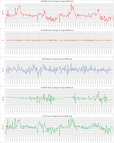
I have analysed the data - calculating the slope of power over 3 adjacent data points (15 minute interval) for each available data point. If any of the three data points is zero then no data is plotted.
There are some oddities these have been plotted but the point is allowed off scale to keep valid data to be on a sensible scale:
The plot colour indicates a different vertical scale. (scales have been corrected)
 |
| 15 days of service |
Over 2 days this looks like:
 |
| 2 days of service |
But this compares with demand which can vary by 170MW/minute
Closing in on a few hours shows:
 |
| 6 hours - Coal replaces Nuclear |
It is interesting to note that at 17 hours 10 minutes it appears as if wind is used for balancing - all fast reaction generators and wind show a drop.
It is also significant that there is little impact of wind variation showing on the fast reactor generators.
Finally Wind output shown over the same few hours:
 | |
| Wind power output added |
No comments:
Post a Comment